The Cognitive Load Problem
Imagine walking into a restaurant, starving. They hand you a 50-page menu with no pictures. Do you feel liberated? No. You feel stressed. You scan it anxiously, terrified of picking the wrong thing, and eventually just order a burger because it’s safe.
Now imagine a restaurant with a menu that has just three items: Steak, Fish, or Vegetarian. You decide in 10 seconds and feel confident.
This is the essence of Hick’s Law. Every option you present to a user requires their brain to:
- Read the option.
- Understand what it means.
- Compare it against all the other options.
- Predict the outcome of choosing it.
This burns mental energy (Cognitive Load). The human brain is lazy; it wants to conserve energy. If the cognitive load is too high, the brain’s defense mechanism is to abandon the task entirely.+1
Where Startups Get This Wrong (And How to Fix It)
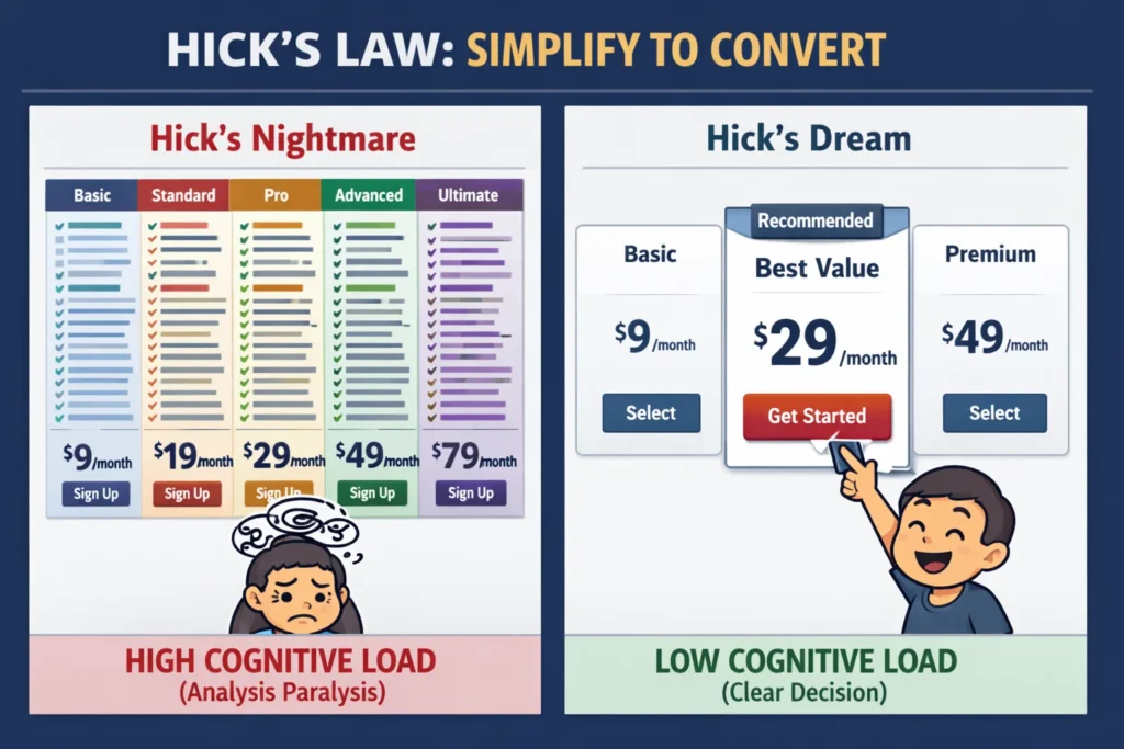
1. The “Enterprise” Pricing Page
- The Mistake: You have 5 pricing tiers: “Basic, Pro, Team, Business, Enterprise.” Below that, a massive comparison table with 60 rows of checkmarks and complex feature names.
- The User Reaction: “I don’t know if I need ‘Advanced API Access’ or just ‘Standard API Access’. I’ll deal with this later.” (They never come back).
- The Hick’s Law Fix:
- Reduce to 3 tiers (e.g., Starter, Growth, Scale).
- Highlight one option as “Most Popular” or “Recommended.” This removes the burden of choice; they can just trust your recommendation.
- Hide the complex comparison table behind a “See full features” link.
2. The “Kitchen Sink” Navigation Bar
- The Mistake: You are afraid users won’t find your features, so you put 15 links in the top navigation bar.
- The User Reaction: Overwhelmed. They ignore the nav bar entirely and use the search box, or worse, they bounce.
- The Hick’s Law Fix:
- Group items into 3-5 main categories.
- Use “Progressive Disclosure”: Show the main categories first, and only reveal sub-options when the user hovers or clicks. (Amazon does this masterfully).
3. The Onboarding Dump
- The Mistake: Asking for 20 pieces of information on the very first screen of signup.
- The User Reaction: “This looks like homework. Goodbye.”
- The Hick’s Law Fix:
- Break the form into multiple steps. Show only one decision per screen.
- Screen 1: “What is your name?” (Next).
- Screen 2: “What is your goal?” (Next).
- By isolating the choice, the decision time for that specific step drops to near zero.
Conclusion
Steve Jobs famously wore the same black turtleneck every day. Why? To remove one decision from his morning. He knew that decision-making energy is finite. Treat your users’ energy with the same respect. Be opinionated. Simplify the path. The best interfaces don’t offer the most choices; they offer the clearest path to value.