The “Quick Trip” Myth
Last weekend, I visited the local Decathlon in Pune. My goal was simple: buy a swimming cap. Total planned cost: ₹149. Time required: 5 minutes.
Reality: I walked out 45 minutes later with a swimming cap, two trekking t-shirts, and a set of resistance bands. Total cost: ₹2,100.
I didn’t “decide” to buy those other things. The store design decided for me. To get from the entrance to the swimming section, I had to walk through hiking, fitness, and racket sports.
In Product Management, we call this a Forced Funnel.
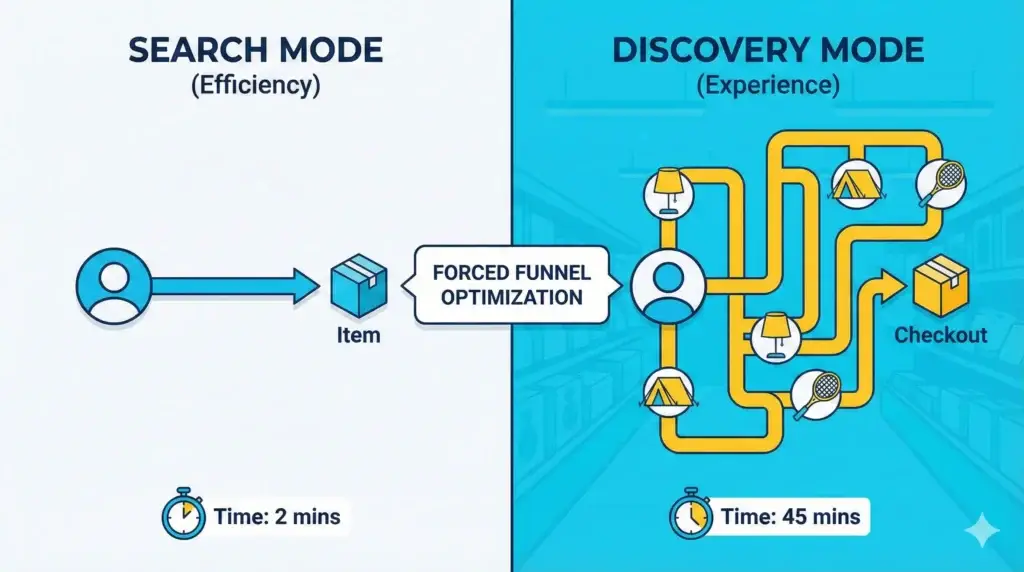
Search vs. Discovery
To understand this strategy, you have to look at the two fundamental ways humans shop (or use software):
1. “Spear Fishing” (Search Mode)
- The User Goal: “I know exactly what I want. Give it to me now.”
- The Best Product: Amazon, Blinkit, Google.
- The Metric: Speed. Friction is the enemy here. If Amazon makes me click 5 times to buy a book, I leave.
2. “Net Fishing” (Discovery Mode)
- The User Goal: “I have a vague need (e.g., ‘furnish my room’ or ‘get fit’), show me what’s possible.”
- The Best Product: IKEA, Decathlon, Instagram, Pinterest.
- The Metric: Dwell Time & Exposure. Friction is the tool here.
The “Gruen Effect”
There is actual science behind this. It is called the Gruen Effect (named after architect Victor Gruen). The goal is to overwhelm the user’s senses with so many cues and options that they forget their original specific mission and enter a state of “receptive wandering.”
Decathlon doesn’t want you to find the water bottle efficiently. They want you to visualize yourself camping. IKEA doesn’t want you to buy a chair. They want you to visualize a cozy Sunday in that living room setup.
They are selling the Context, not the SKU.
The Digital Equivalent: The “Feed”
You might think, “I build software, I don’t build stores. We hate friction.”
But look closely at the most successful apps:
- Instagram/TikTok: They removed the “Pagination” (Page 1, Page 2) and replaced it with an “Infinite Scroll.” You cannot stop. The friction of “deciding to go to the next page” was removed to keep you in the funnel forever.
- Netflix: The “Auto-Play” feature. They don’t wait for you to click “Next Episode.” They force the next piece of content on you before you can decide to leave.
These are digital versions of the IKEA path. They optimize for Time on Platform, not Speed of Task.
The PM Lesson: When to Add Friction
As a PM, your instinct is always to reduce clicks. But ask yourself:
- Is my user here to complete a task? (e.g., Pay a bill, book a cab).
- Strategy: Remove all friction. Be like Amazon.
- Is my user here to discover value? (e.g., Browse content, shop for fashion, explore new features).
- Strategy: Add friction. Remove the search bar. Force the scroll. Make the user walk the path.
If IKEA had a “shortcut to the warehouse” button at the entrance, their revenue would drop by 40% overnight.
The Takeaway: Don’t just measure “Time to Complete Task.” Sometimes, the value lies in the journey, not the destination.