Enter Customer Journey Mapping, your very own “Map to Mordor,” but for user experience. It’s the process of creating a visual story of your customer’s interactions with your company. It’s not just a flowchart; it’s an empathy-building exercise that forces you to take off your “I work here” glasses and see the world through your customer’s eyes. You stop seeing isolated touchpoints like “the website” or “the call center” and start seeing the complete, often messy, end-to-end adventure.
The goal? To find where the road gets rocky and the giant spiders of bad UI appear, so you can build a better, safer path for future travelers.
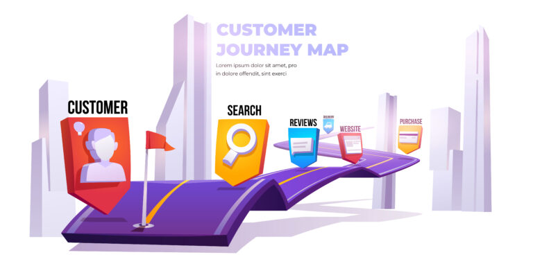
Template: The Anatomy of a Journey Map
Think of it as a grid where you chronicle the customer’s tale:
| Phases | (e.g., Awareness, Consideration, Purchase, Service, Loyalty) |
|---|---|
| Actions | What is the customer physically doing? (e.g., Googling solutions, reading reviews, clicking ‘buy’) |
| Thoughts & Feelings | What’s their inner monologue? Are they excited, confused, anxious? (e.g., “Is this worth the price?”, “YES! It’s finally here!”) |
| Pain Points | Where do they want to throw their laptop out the window? (e.g., Confusing checkout form, long delivery time, a 404 error) |
| Opportunities | Where can you swoop in like a giant eagle and save the day? (e.g., Simplify checkout, offer order tracking, create helpful 404 pages) |
Real-Life Example: The Starbucks Symphony
Starbucks doesn’t just sell coffee; it sells an experience, and they’ve meticulously mapped it. Think about their journey:
You (Phase: Consideration) feel that afternoon slump. You open the Starbucks app. The (Action) is Browse the menu. Your (Feeling) is anticipation. But wait, (Pain Point) the app is slow to load your payment method. Annoying. Starbucks identified this and created (Opportunity) one-click ordering and streamlined payment options.
Later, you walk in. The smell of coffee hits you (Moment of Delight). They know your name from the app (Personalization). The barista gives you a smile. Every single step, from the digital interaction on the app to the physical pick-up, has been mapped and optimized to be as seamless and pleasant as possible. They didn’t just map the “making coffee” part; they mapped the entire “I need a pick-me-up” job.
So, map your customer’s journey. You might be surprised to find that the biggest dragon to slay isn’t a missing feature, but a broken link in their adventure.