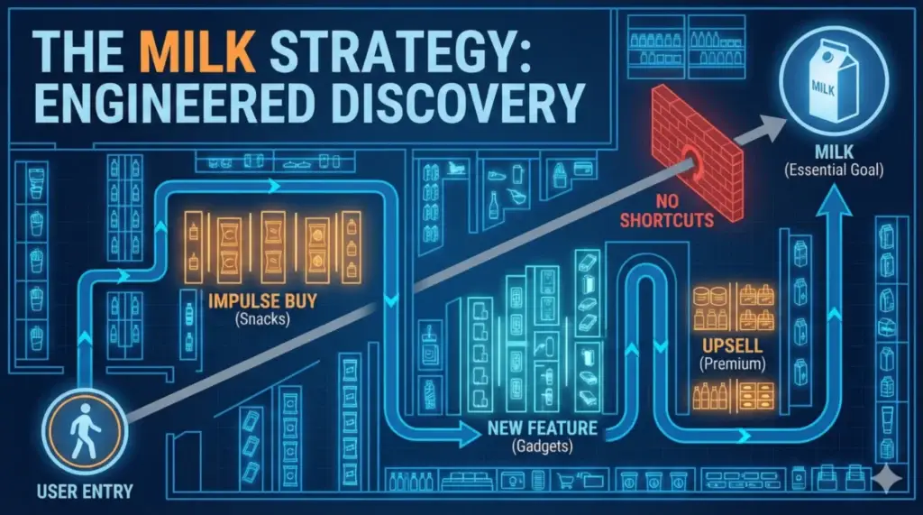
The Supermarket Layout
It is a universal truth of retail: The essentials (Milk, Bread, Eggs) are never near the door. They are located in the farthest, deepest corner of the store. This is known as the “Perimeter Strategy.”
Retailers know that 90% of customers have “Milk” on their mental checklist. It is a high-intent, low-negotiation item. You aren’t going to leave the store without it. So, they use the Milk as an Anchor.
To reach the Anchor, you must traverse the “Exposure Zone”—aisles filled with high-margin, impulse-buy items like snacks, magazines, and new arrivals.
The Endowment Effect
As you walk past these items, a psychological bias called the Endowment Effect (or mere exposure effect) kicks in. Just seeing the item increases the likelihood of you wanting it. Picking it up to read the label increases the likelihood of purchase by 40%.
If you could grab the milk at the entrance and leave, the store would lose that opportunity for discovery.
The Digital Equivalent: Friction vs. Flow
In Product Management, we are often taught to “reduce friction.” We want to get the user to their goal in the fewest clicks possible. But sometimes, efficiency is the enemy of value.
1. The “Daily Reward” Pattern (Gaming) In mobile games, the “Free Daily Reward” is never on the home screen. You usually have to open the “Shop,” scroll past the “Special Offer Bundle ($4.99),” and then claim your free coin.
- The Anchor: The Free Coin (Milk).
- The Exposure: The $4.99 Bundle (Chips).
2. The “Logout” Pattern (SaaS) Try finding the “Delete Account” or “Logout” button in any major app. It is never on the dashboard. It is hidden under Profile > Settings > Privacy > Scroll Down. They add intentional friction to preventing you from leaving (Churn), while making the “Upgrade Plan” button visible on every single page.
The PM Lesson: Designing the “Long Way Home”
When designing your user journey, categorize your features:
- The Hook (Milk): What does the user need to do? (e.g., Check their bank balance).
- The Goal (Chips): What do you want them to see? (e.g., Your new Credit Card offer).
The Strategy: Don’t hide the Hook (that frustrates users), but don’t make it a shortcut either. Place your “Goal” along the path to the “Hook.”
- Bad UX: Pop-up ads that block the user. (Annoying).
- Good UX: Placing the “Credit Score Check” widget right next to the “Account Balance” text. (Contextual Discovery).
Conclusion
The next time you are annoyed that you have to walk 500 steps to buy a liter of milk, remember: You are in a physical sales funnel. And if you walk out with a Snickers bar you didn’t plan to buy, the design worked.
The Takeaway: Efficient design gets the job done. Effective design builds the business. Know when to be efficient and when to be scenic.